polyglot-tools-docs
Voronoi Treemaps and other layouts
Voronoi Treemaps and other layouts
What is a weighted voronoi treemap?
A treemap is generally a way of representing a hierarchy of data in a recursive way. A weighted treemap is weighted so that each node has area proportional to it's value - in our case, to the lines of code.
Traditional D3 treemaps are typically rectangular: https://observablehq.com/@d3/treemap - this is where I started out. But rectangular maps get quite hard to understand visually - edges line up in ugly ways, and you can't really see what is a parent and what is a child.
Instead, I'm using a layout based on Weighted Voronoi Diagrams - which also have the property that each area shown is proportional to the value, but are much more organic.
How is this a tree?
The Voronoi layout algorithm is applied recursively for each directory and subdirectory in the codebase. For example, when laying out the qgis codebase the first level is laid out like this:
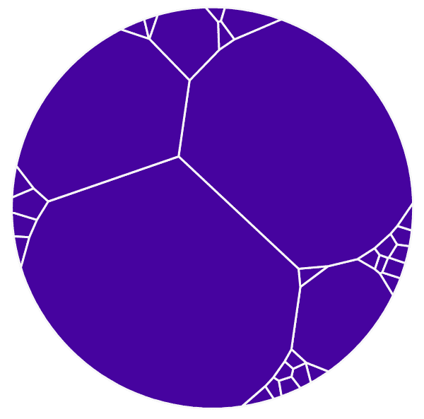
where each segment is one top-level directory like /src or /test, with a size roughly proportional to the total lines of code inside that directory.
Then each segment of this diagram is subdivided with another voronoi layout:
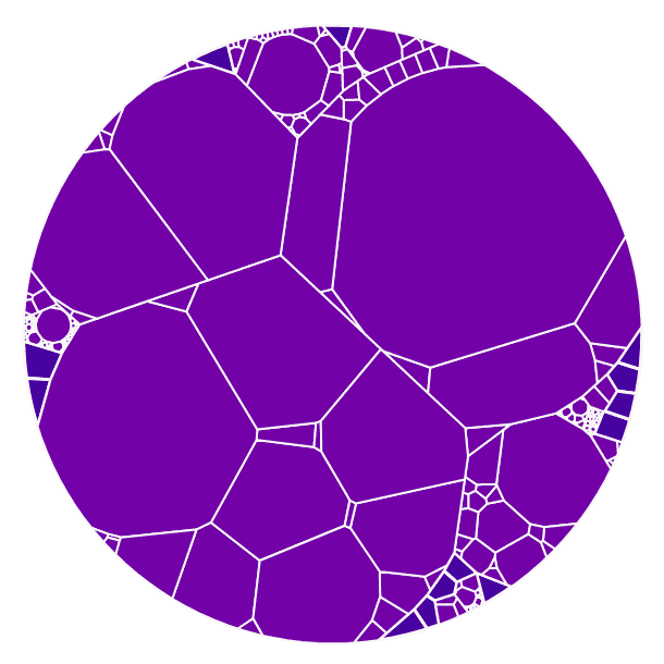
Here each segment is a file or directory one layer deeper, such as /src/core
This continues until all files are mapped (though you can set a limit in the UI, with the 'display maximum depth' advanced option):
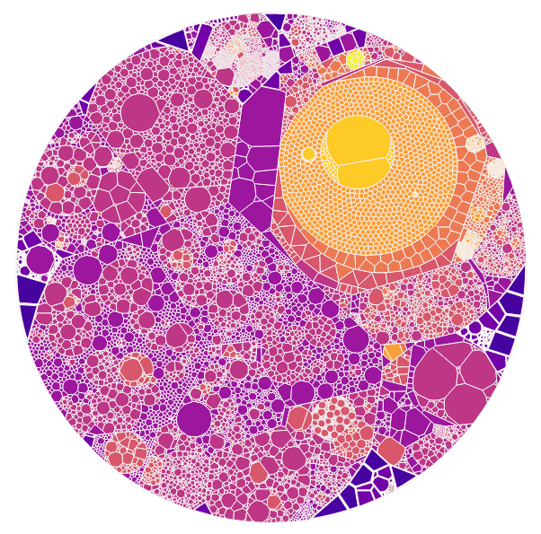
What about those circles on some diagrams?
The layout tool has a command-line option --circles which uses d3's circle packing algorithm for just the top layer of layout.
This is very useful for when you have multiple repositories - each repository (or each top-level directory at least) is shown as a circle, which makes the split between repositories clearer.
Circle packing still keeps areas proportional to "size" in terms of lines of code, as long as we only use the circle packing algorithm at the top level.
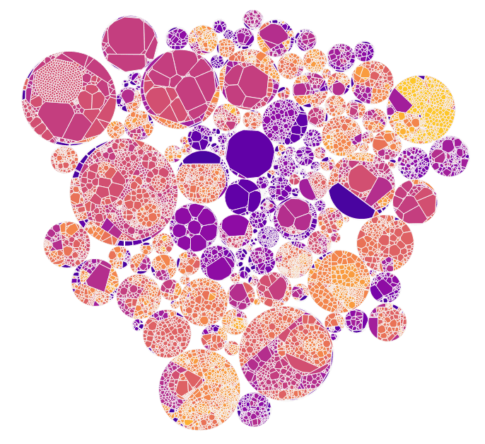
For example, the openmrs codebase is made up of many repositories - if you view just the top level circles, it looks like this:

Here each circle is a whole git repository.
Deeper layers are then laid out using the same Voronoi algorithm as above:

And so on, until the final layout is:
